 Fribly Editorial
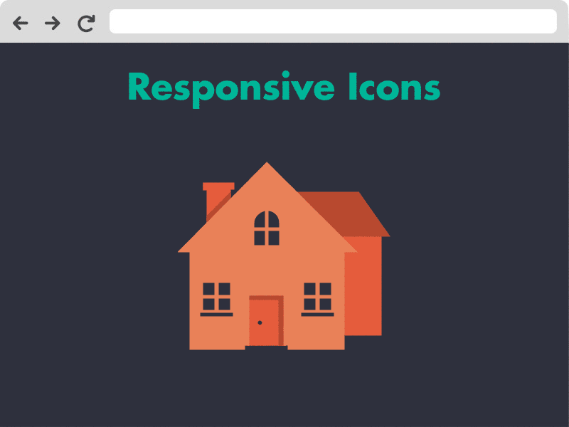
Honestly, this topic sounded a little bit strange to me when I first learned about responsive iconography, as everybody thinks that it means to make the icons scale well for various devices. However, the idea of responsive icons it takes both responsive design and iconography a step further, much further.
What are these said responsive icons?
Responsive icons do not mean that the width of the screen determines how big an icon is displayed; actually it means that a different icon is displayed based on the size it is presented in. This means that screen size does not matter but the size of the icons itself does. This is because some icons will be displayed in various sizes – at the same time, on the same screen.
The difference between icons won’t be anything more but the quality of detail displayed. We are talking about having a lot of detail in an icon which is displayed big at say 500px by 500px, a little less detail for an icon which is displayed 250px by 250px and as little detail as possible for an icon that is only 25px by 25px in size. I’m sure you can image that a single icon would look boring and even render poorly if you have very extensive icon and displaying it very small.
By creating responsive icons we are taking iconography to a whole new level where it helps create a better experience, better usability and better visual design for users. By going with responsive icons the idea is to make the web better, which is what everyone wants and needs for you as the designer and your users.
Responsive Icons Project by Joe Harrison
‘Responsive Icons’ is a project that explores scalable iconography. The concept interrogates the varying complexity of symbols used on devices, and aims to find the perfect balance of simplicity in relation to screen size. The concept is very much in its early stages.
Iconic Project
 Iconic is an icon set truly designed for the modern web, pushing iconography forward with new technologies, techniques and thinking. Iconic takes full advantage of modern web standards to allow you to adjust elements within icons dynamically. Iconic is a responsive icon set to achieve a significantly greater range of legibility, each icon will be designed for different size ranges (small, medium and large). Iconic allows you to style its icons in the browser with basic CSS. The icons are semantically structured to make styling clear and straightforward.

GIPHY App Key not set. Please check settings