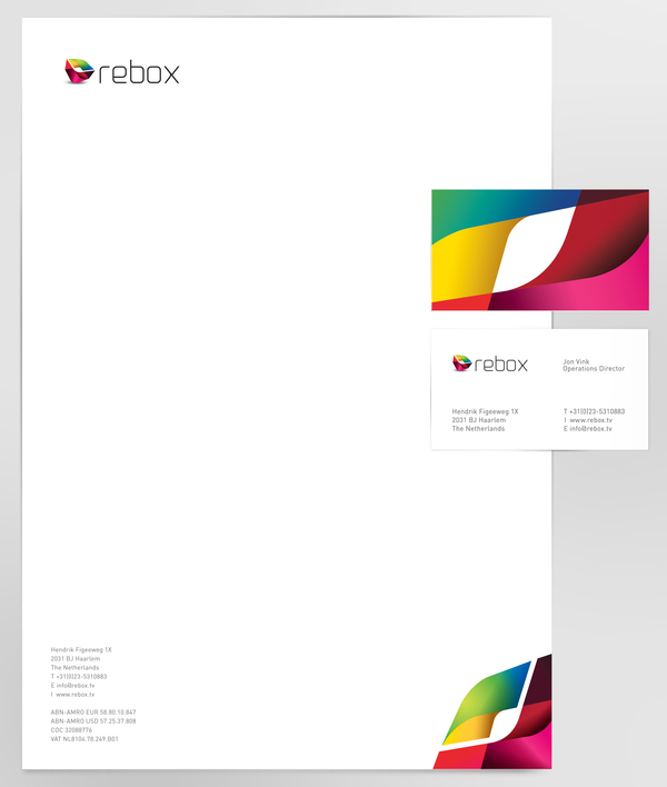
Rebox is an innovative and flexible full service set-top box manufacturer from The Netherlands. The logotype was carefully created to encompass and represent their brand’s philosophy.
It embodies the idea of the meaning of rebox, creating a symbol that communicates the quality of their services and professionalism, maintaining a trustworthy and friendly brand.
The symbol design becomes from the box, inspired by the round edges of the rebox products. This box icon is a square in perspective that communicates innovation and the rounded forms make it flexible and interactive. Some texture was designed in order to wear the box, taking like reference the origamy style to get a hip and young look.
REBOX Identity designed by PAOLA FLORES


GIPHY App Key not set. Please check settings